
Airbnb Geostatistical Analysis
Applying my coursework from STATS C173/C273
On this page
Predicting the price of Airbnb listings is a pretty standard project for most people in the stats / data science / ML space. I mean, the data is fairly comprehensive and large and is easily publicly accessible. So what makes this project any different?
I wanted to try looking at this pretty standard problem through a completely different lens. After taking STATS C173/273 at UCLA (one class btw it’s just cross-listed so the designation is odd) I learned about kriging and spatial prediction and testing techniques. Specifically, accounting for spatial autocorrelation in a variable for predicting new values of the same value.
Generally, this is applied to more natural phenomena, like weather events, that are easily designated as geostatistical events. However, I thought it would make sense to consider Airbnb listing themselves a form of geostatistical data. After all, prices vary by neighborhood and location is a prime determinant of listing price. With that in mind, I decided to see for myself if this was a valid way of price prediction.
Note: All the data used in this report is from the 14 December 2024 report of Airbnb data from https://insideairbnb.com/get-the-data/.
Before I began my actual code, I wanted to set up my R environment to make it a bit more efficient.
library(doParallel)
ncores <- detectCores()
clus <- makeCluster(ncores - 1)
registerDoParallel(clus)
I then loaded in the libraries I planned to use for this project.
library(tidyverse)
library(maps)
library(geoR)
library(gstat)
library(sf)
library(gridExtra)
library(kableExtra)
Before I started working with the data set, I had to do some modification. I selected the predictors I wanted to consider and made sure that no two listings had the same combination of latitude and longitude. I then dropped any observations with NA values and randomly sampled 1000 observations to create the final data set. After this, I created factors for the appropriate values and fixed some issues via manual inspection.
austin_listings_orig <- read_csv("/home/narenprax/Documents/GitHub/STATS-C173-273/Final Project/listings.csv")set.seed(0)
austin_listings <- austin_listings_orig %>%
select(c(longitude, latitude, property_type, room_type, bathrooms, bedrooms, beds, price)) %>%
distinct(longitude, latitude, .keep_all = TRUE) %>%
drop_na() %>%
sample_n(1000) %>%
mutate_if(is.character, as.factor)
austin_listings$price <- as.numeric(gsub("[^0-9\\.]", "", austin_listings$price))Data exploration and non-spatial analysis
Before jumping into the main analysis, I explored the finalized dataset first.
Data overview
library(DataExplorer)
plot_intro(austin_listings)
kable(summary(austin_listings))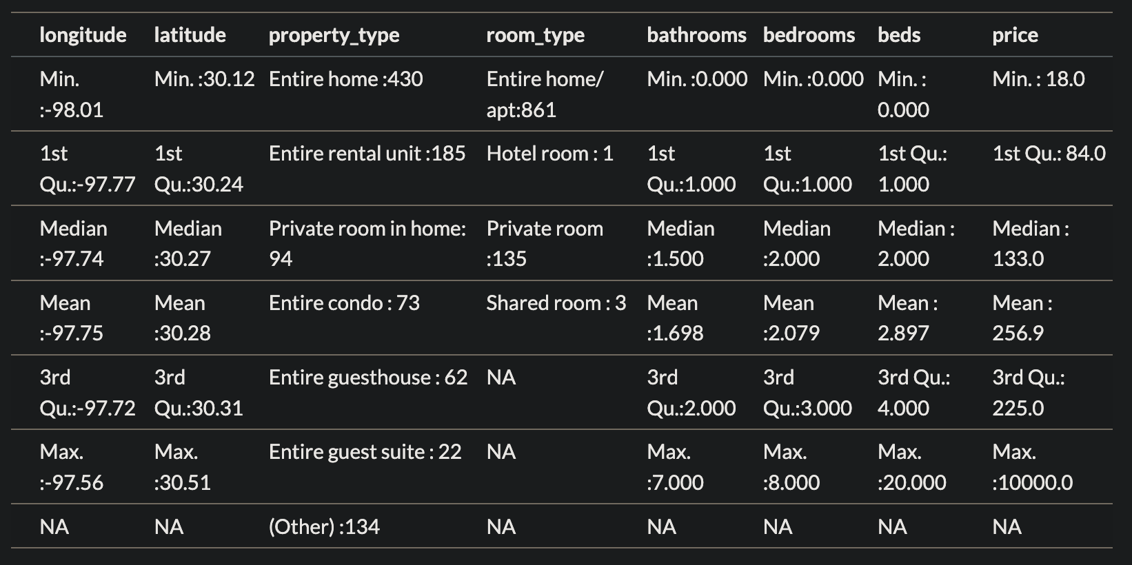
Numerical exploration
long_hist <- austin_listings %>% ggplot(aes(x = longitude)) +
  geom_histogram(aes(y = ..density..)) +
  geom_density(col = "red")
lat_hist <- austin_listings %>% ggplot(aes(x = latitude)) +
  geom_histogram(aes(y = ..density..)) +
  geom_density(col = "red")
bed_hist <- austin_listings %>% ggplot(aes(x = bedrooms)) +
  geom_histogram(aes(y = ..density..)) +
  geom_density(col = "red")
bath_hist <- austin_listings %>% ggplot(aes(x = bathrooms)) +
  geom_histogram(aes(y = ..density..)) +
  geom_density(col = "red")
beds_hist <- austin_listings %>% ggplot(aes(x = beds)) +
  geom_histogram(aes(y = ..density..)) +
  geom_density(col = "red")
price_hist <- austin_listings %>% ggplot(aes(x = price)) +
  geom_histogram(aes(y = ..density..)) +
  geom_density(col = "red")

grid.arrange(long_hist, lat_hist, bed_hist, bath_hist, beds_hist, price_hist, nrow = 3)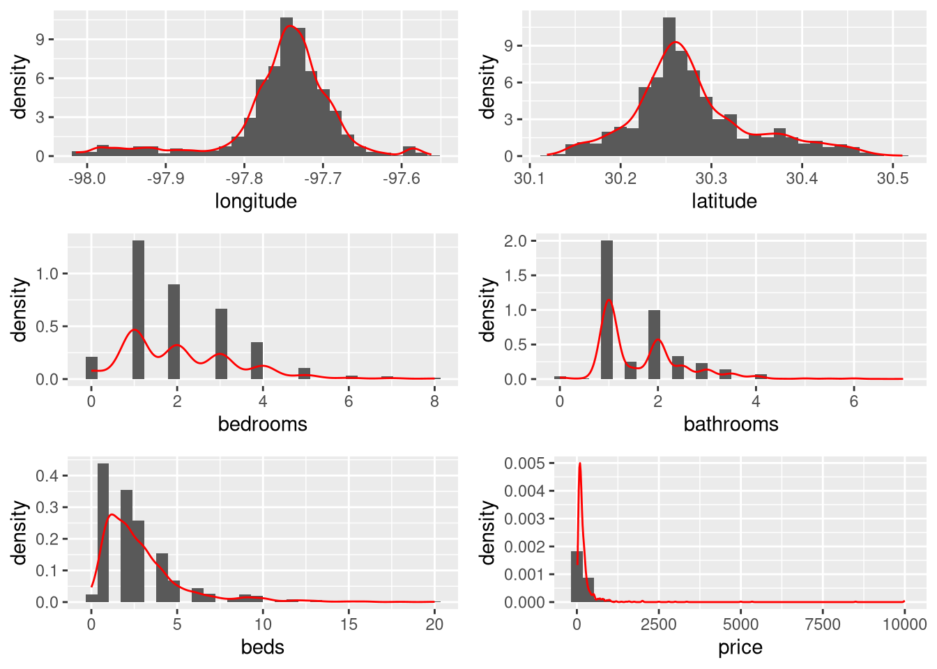
We can see that most of the numeric variables have very skewed distributions.
Categorical data exploration
bar_prop <- austin_listings %>% ggplot(aes(x = property_type)) +
  geom_bar() +
  coord_flip()
bar_room <- austin_listings %>% ggplot(aes(x = room_type)) +
  geom_bar() +
  coord_flip()
grid.arrange(bar_prop, bar_room)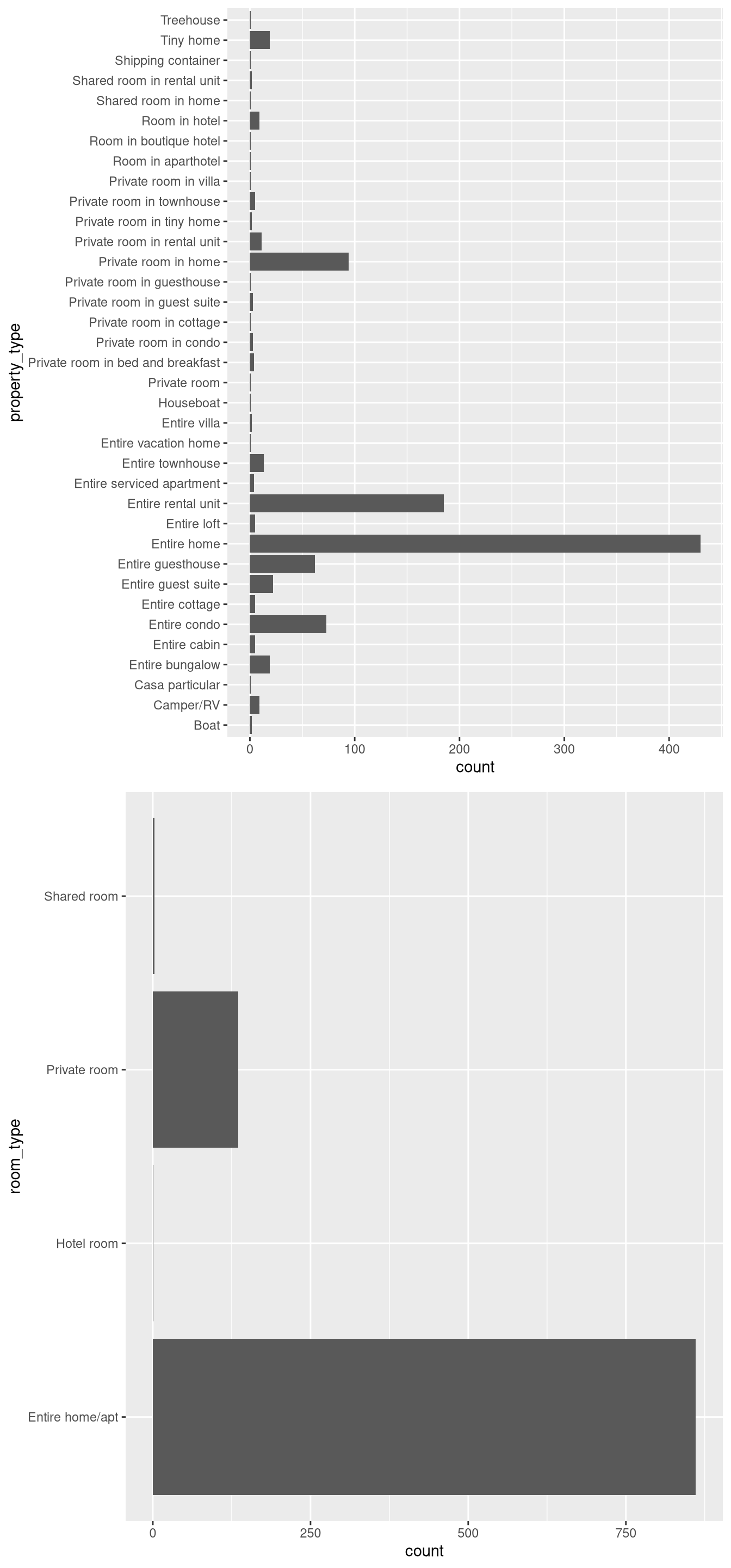
The property type graph shows a clear majority of listings are entire homes or rental units, which is unsurprising given Airbnb marketing. A notable thing I noticed here was that there were listings that were rooms in hotels, which seemed contradictory to the whole concept of Airbnb.
Variable relationship exploration
plot_correlation(austin_listings)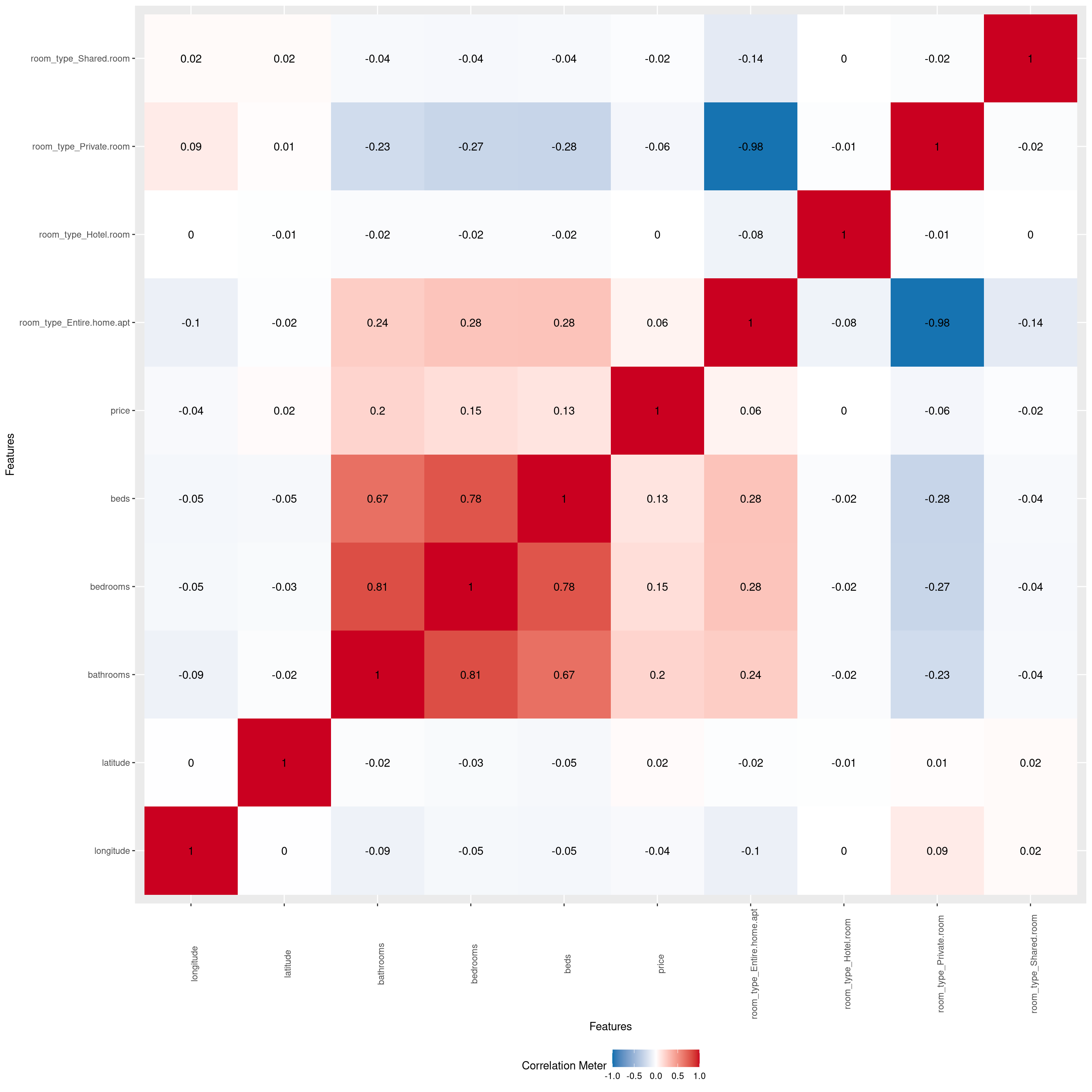
We can see some noticeable correlation among many of the predictors, with the private room type and the entire home apartment room type having the strongest correlation.
Now that we’ve gotten an understanding of what our data looks like, we proceed to the non-spatial analysis component.
library(glmnet)

set.seed(0)

pred <- austin_listings %>% select(-price)
X <- data.matrix(pred)
y <- austin_listings$price

cv.model <- cv.glmnet(X, y, alpha = 1)
lam <- cv.model$lambda.min

best_mod <- glmnet(X, y, alpha = 1, lambda = lam)
coef(best_mod)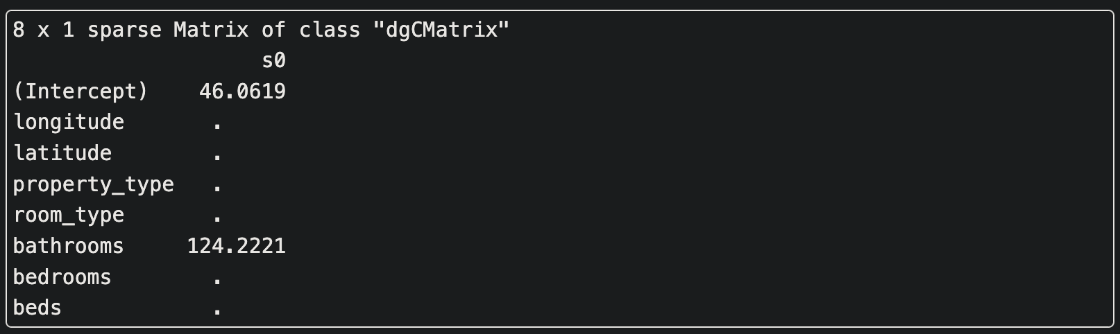
Based on the LASSO method of variable selection, only the variable bathrooms is a significant predictor for the price of a individual listing. However, knowing there is another variable with relation to price helps us decide the specific kriging method for the best price prediction model.
With that, we move on to geospatial analysis.
Geospatial analysis
h-scatterplots and correlogram
library(sp)
library(gstat)

sp_listings <- austin_listings

coordinates(sp_listings) <- ~ longitude + latitude

qq <- hscat(price ~ 1, sp_listings, c(0, 20, 40, 60, 80, 100, 120, 140, 160, 180))

plot(qq, main = "h-scatterplots")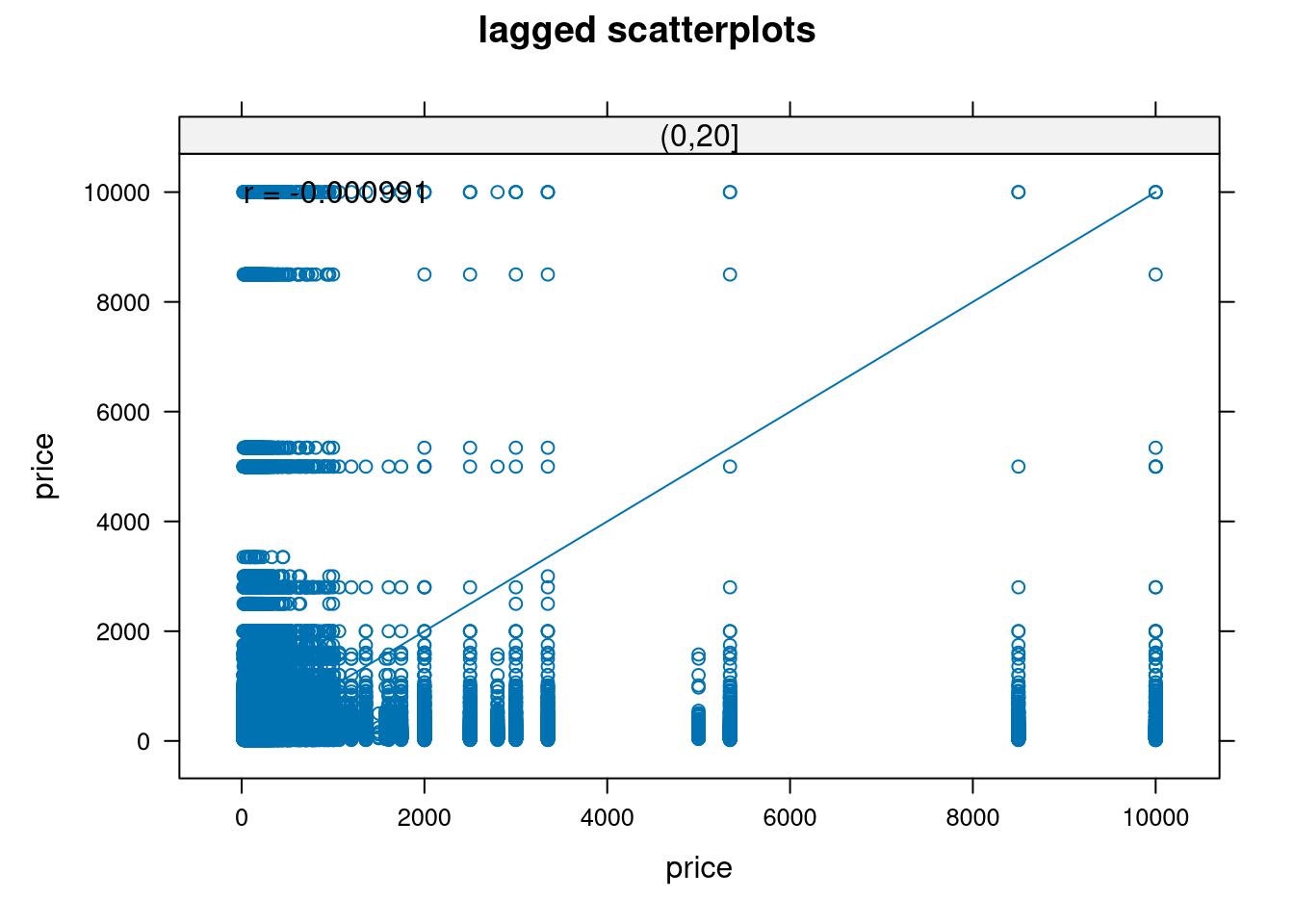
plot(c(10, 30, 50, 70, 90, 110, 130, 150, 170), c(0.824, 0.811, 0.734, 0.684, 0.629, 0.517, 0.473, 0.37, 0.264), type = "l", xlab = "Separation distance (h)", ylab = "Correlation coefficient (r)", main = "Correlogram for AirBnB pricing data", xaxt = "n", yaxt = "n")

axis(1, at = seq(10, 240, by = 20), labels = seq(10, 240, by = 20))

axis(2, at = seq(0, 1, by = 0.1), labels = seq(0, 1, by = 0.1))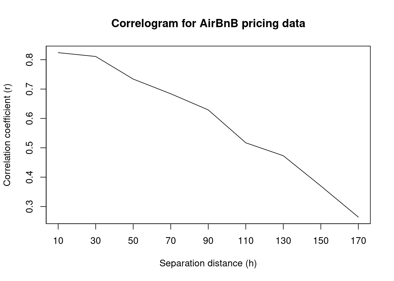
Both the h-scatterplots and the correlogram indicate that there seems to be spatial correlation between points. This is especially noticeable in the correlogram as we can visualize a clear negative trend in correlation coefficient as the separation distance increases. This seems to justify our spatial correlation approach.
Variograms
Sample variogram
Scaling is done here to make variogram creation easier later on.
g <- gstat(id = "scaled price", formula = scale(price) ~ 1, locations = ~ longitude + latitude, data = austin_listings)
samp <- variogram(g)
plot(samp)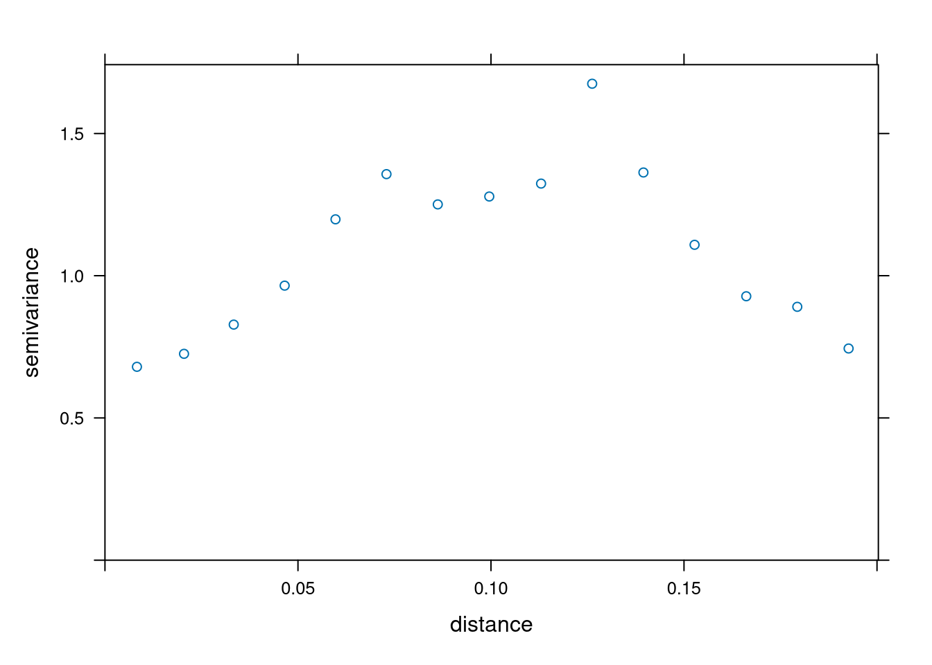
Different covariance function fits (using Cressie’s weights)
We use Cressie’s weights as a compromise between the techniques of ordinary least squares and generalized least squares. This way we can reduce computation but also account for covariance structures.
The two selected covariance functions are the exponential and spherical covariance functions.
exp_fit <- fit.variogram(samp, vgm(1.2, "Exp", 0.7, 0.3), fit.method = 2)
sph_fit <- fit.variogram(samp, vgm(1.2, "Sph", 0.7, 0.3), fit.method = 2)

plot(samp, exp_fit)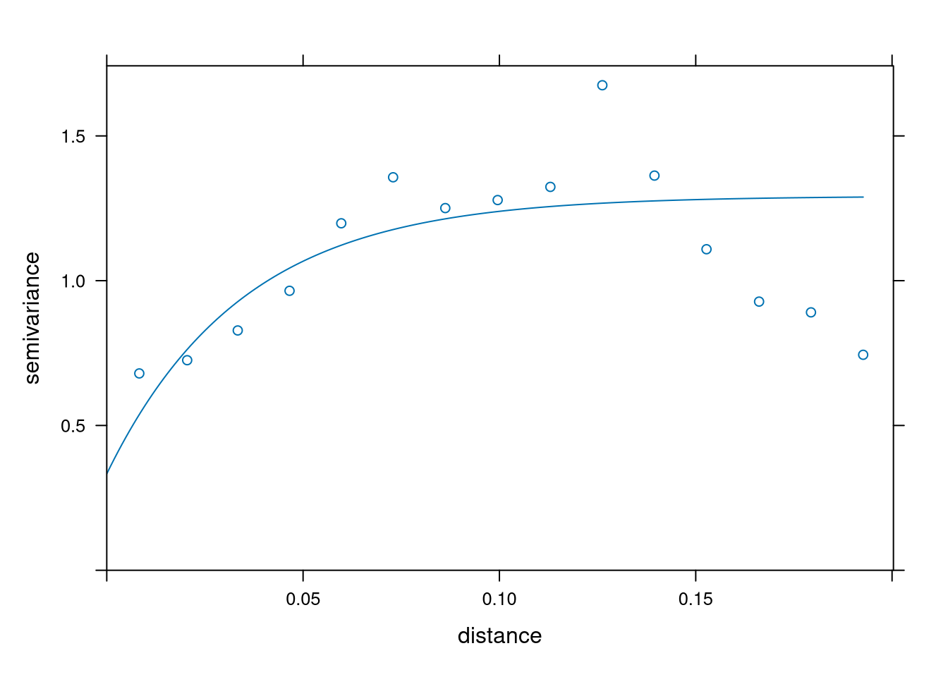
plot(samp, sph_fit)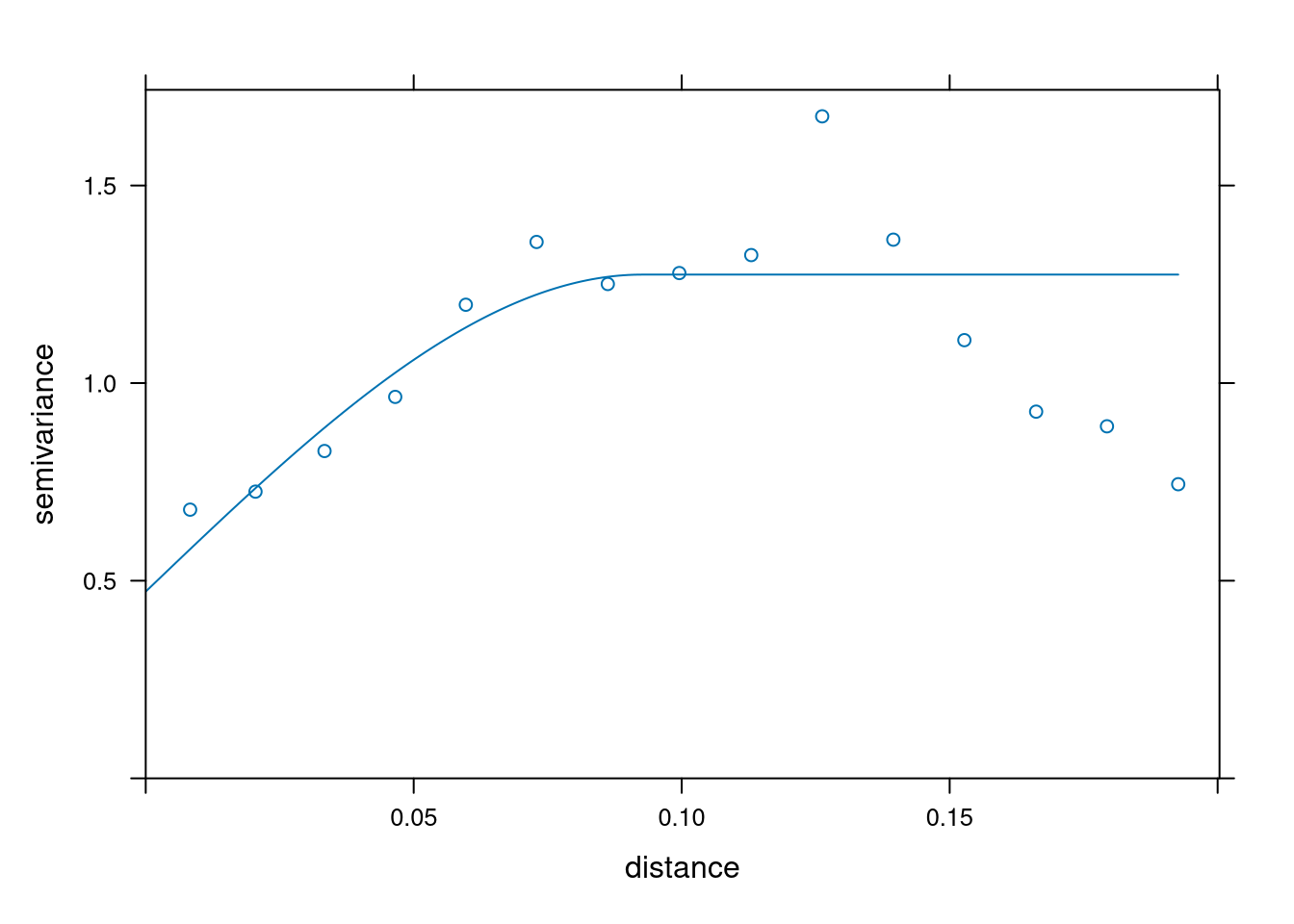
Visually it is hard to choose the best covariance function. Instead, we will minimize PRESS (predicted residual error sum of squares). Through cross-validation, we’ll select a covariance function for our model.
Cross validation
sl <- sample(1:1000, 700)

train <- austin_listings[sl, ]
test <- austin_listings[-sl, ]
cvalid <- krige(id = "scaledprice", scale(price) ~ 1, locations = ~ longitude + latitude, model = exp_fit, data = train, newdata = test)
difference <- scale(test$price) - cvalid$scaledprice.pred
summary(difference)
press1 <- sum(difference^2)
press1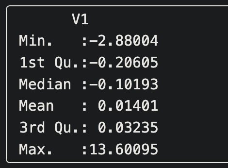

We see here that the spherical covariance model minimizes PRESS so we continue onward with this covariance function.
Kriging
We know there is one related variable, bathrooms, that has the most correlation with price. Let’s investigate whether cokriging with this predictor would be the best approach to price prediction.
Ordinary kriging
x.range <- as.integer(range(austin_listings[, 1]))
y.range <- as.integer(range(austin_listings[, 2]))
grd <- expand.grid(
  longitude = seq(from = x.range[1], to = x.range[2], by = 0.001),
  latitude = seq(from = y.range[1], to = y.range[2], by = 0.001)
)
pred <- krige.cv(formula = scale(price) ~ 1, data = austin_listings, locations = ~ longitude + latitude)mean(pred$residual)
Ordinary co-kriging
Adding the covariate and looking at the variogram plots:
all <- gstat(g, id = "bathrooms", formula = scale(bathrooms) ~ 1, locations = ~ longitude + latitude, data = austin_listings)

var_all <- variogram(all)
all_fit <- fit.lmc(var_all, all, model = sph_fit)
plot(var_all, all_fit)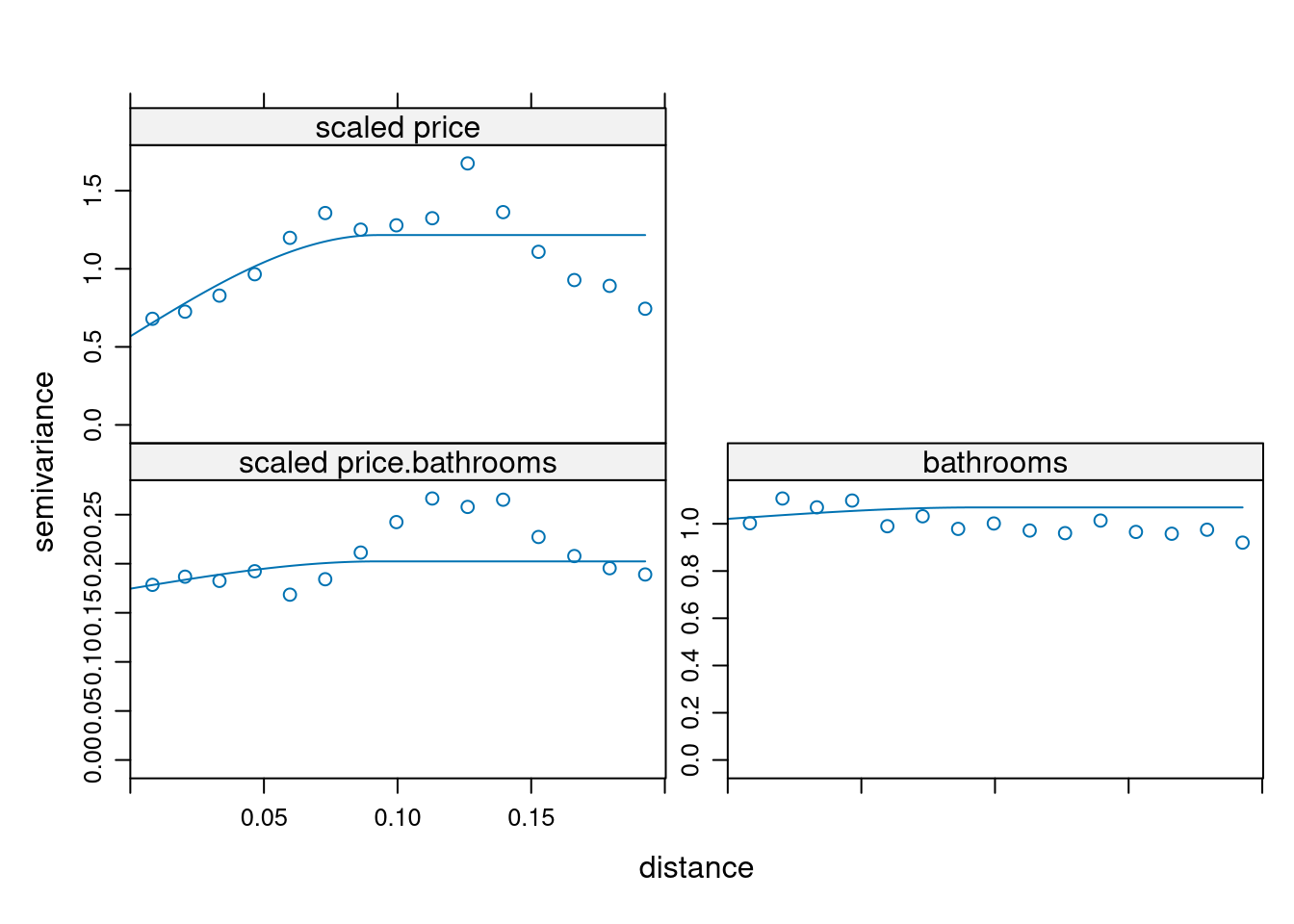
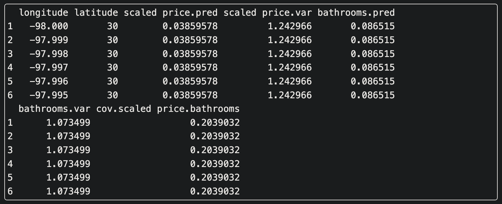
ck <- predict(all_fit, grd)cok <- gstat.cv(all_fit)print(head(pred))
print(head(ck))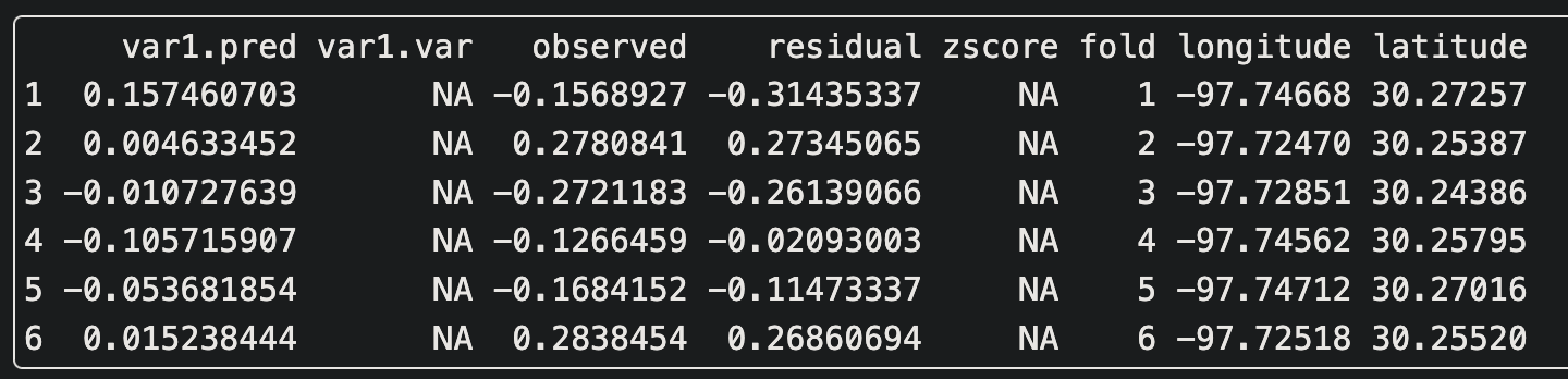
library(lattice)

levelplot(ck$`scaled price.pred` ~ longitude + latitude, ck,
  aspect = "iso",
  main = "ordinary co-kriging predictions"
)
levelplot(ck$`scaled price.var` ~ longitude + latitude, ck,
  aspect = "iso",
  main = "ordinary co-kriging variance"
)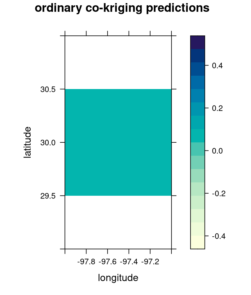
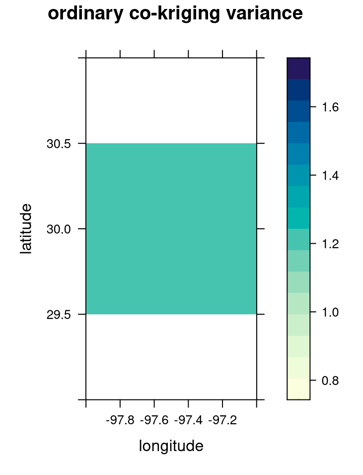
We can see lots of uniformity between the co-kriging predictions and variance.
Is it better than ordinary kriging?
In this case, it looks like ordinary kriging is better as the cokriging results are too uniform and don’t accurately capture the variation in pricing amongst Austin listings. Our final model is the spherical covariance model with ordinary kriging.
Note on the final kriging predictions
The inputs of this model must be scaled which means that the resulting predictions have to be un-scaled to the original units.
Check out the learning log for an interactive Python demo that simulates this spatial interpolation concept!